The Burrow

Sep 14, 2022
We all know how important it is to eat healthily, but with so many delicious and indulgent options tempting us from the store shelves, this can sometimes be tricky. And let’s face it, a chocolate bar is definitely tastier and easier to get than your classic five-a-day.
With the wealth of food options available to us in the developed world, you’d think we’d have an easier time maintaining a balanced diet, but time and again, studies have hinted that our diets aren’t necessarily as healthy as they could be. We certainly consume a lot more added sugars and fats than many other countries.
We do have many advantages available to us that can help offset our diets, however, including easy access to exercise facilities and health insurance.
For example, some extras policies in Australia cover dietetics, or other lifestyle benefits such as health checks and disease management (including diabetes). Some hospital policies may also cover weight loss surgery or other diet-related illnesses. With such a variety of options for health insurance available, many of us can afford to be that little bit more indulgent with the foods we consume.
But in order to see where countries such as Australia, the UK and Canada fall on the healthy diet spectrum, and how they compare to other countries in life expectancy, our team put their heads together to analyse global food supplies for different countries, and compared them to so-called blue zone countries; those areas that have a higher average life-expectancy.
By examining the correlation between food categories and life expectancy, alongside other important health factors, we pulled together a set of tables displaying the healthiest countries in the world, as well as the type of diets they favour.
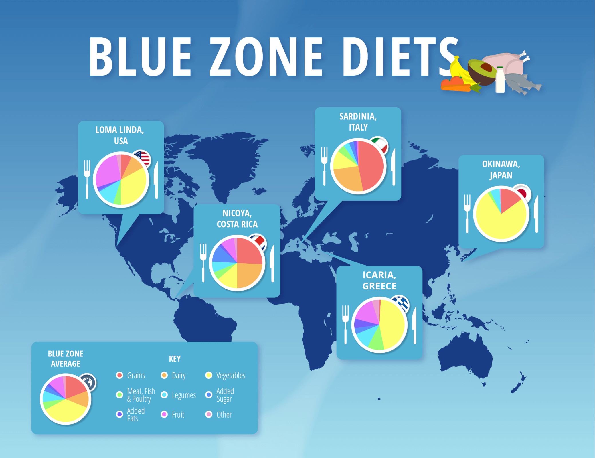
As we mentioned, blue zone countries are those areas in the world which have the highest average life expectancy. As it stands, the current top five blue zone locations in the world are the following:
Despite being spread out across the globe, all of these locations share similar diets that include high proportions of vegetables, wholegrain foods, and legumes. Some areas, particularly Sardinia and the Nicoya Peninsula, also favour a high dairy intake, while places like Okinawa and Icaria eat no dairy but do eat substantially more vegetables.
The diets of all these locations also contain minimal added sugars and fats, as well as a low meat intake. A higher proportion of legumes than meat is consumed in these areas overall, hinting at a distinctly plant-heavy diet.
Of course, there are other factors besides diet that we need to consider when assessing why an area might fall into the blue zone. In many cases, societal differences may play a key part in determining why these people live longer and eat the way they do, as well as local living conditions.
For example, in Japanese culture, you’re expected to eat slowly and with smaller portions. In Italy, there’s a focus on eating fresh ingredients, while in Greece, they eat a lot of fish that are filled with essential oils thanks to easy sea access. Costa Rican diets, on the other hand, include lots of beans and rice – food types that are healthy and easily grown there.
The diet and lifestyle of the residents in Loma Linda are particularly interesting. While being a large Californian city and having all the trappings that come with that, Loma Linda is also home to one of the largest populations of Seventh-day Adventists. This group live off a biblical diet of organic produce, with no meat besides fish.
Clearly, a healthy diet has the potential to increase your life expectancy, but does the diet followed by these blue zone locations translate to them being the countries with the healthiest diets in the world?
Based on the average data that we pulled for our top blue zone countries, we were able to take this and use it as a baseline average for a healthy diet and compare that to countries around the world.
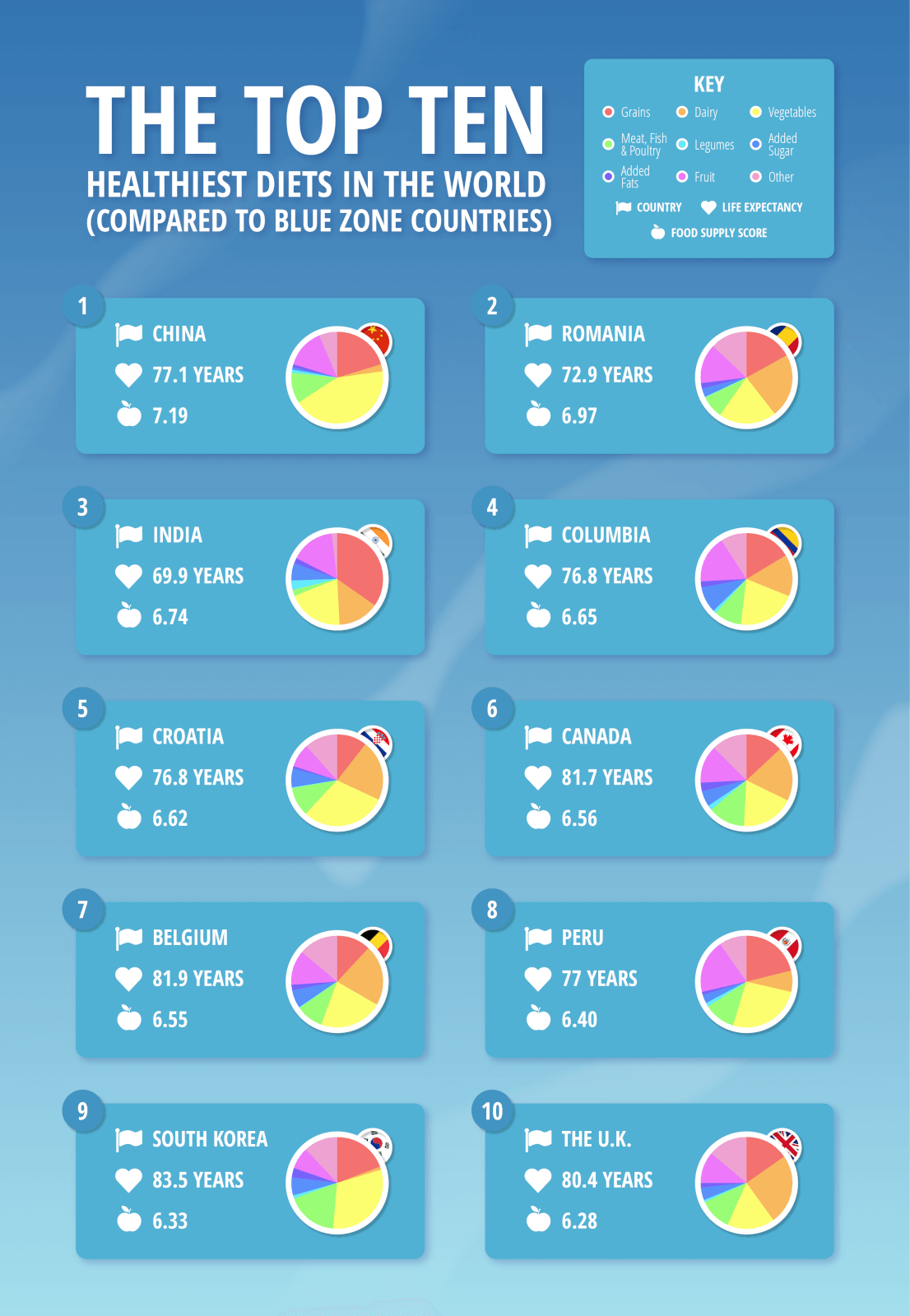
Interestingly, while all our blue zone locations contain a specific place where life expectancy is highest when looking at diets on a country-by-country basis, not one of the blue zone countries made the top ten.
And unlike the blue zone countries, the countries that made our top ten are all vastly different in certain diet areas and food supply. For example, China and India consume a higher quantity of wholegrains compared to the UK and Canada, while South Koreans eat a staggering amount of meat, fish, and poultry in relation to almost all other countries.
But it’s not just well-known developed countries that sit in our top ten. Both Colombia and Peru have high life expectancies but have relatively low food supply quantities when compared to other more developed countries. Despite this, they both ranked higher than Australia, with the higher portions of fruit consumed here potentially having an impact.
Interestingly, in spite of such a range of countries sitting in the top ten, one common trend amongst them was their life expectancy. With the exception of India, which has a life expectancy of 69.9, all these countries have a life expectancy of 72 or higher; Australia, the UK, Canada, South Korea, and Belgium being the highest with life expectancies above 80.
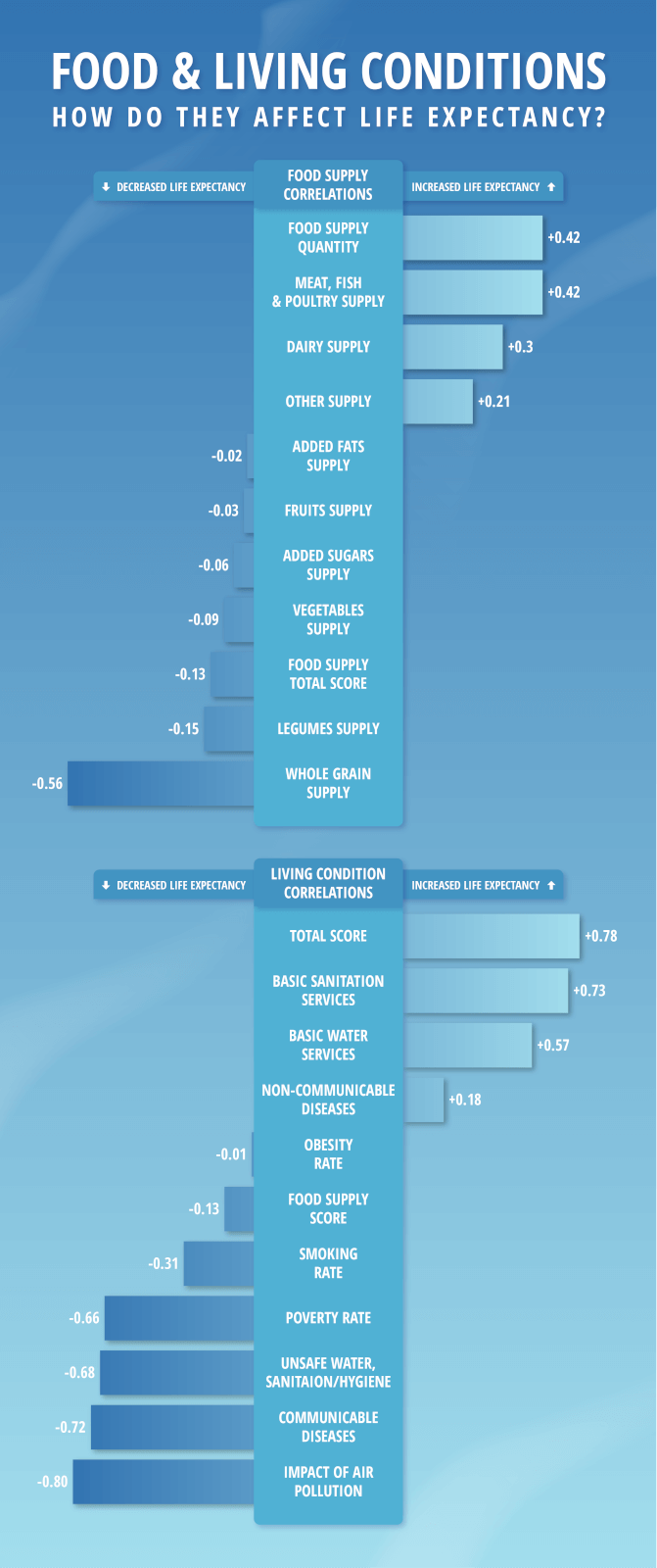
What’s clear from this data is that a good diet on its own doesn’t necessarily correlate to a high life expectancy despite the clear correlation presented by blue zone countries; after all, correlation doesn’t equal causation.
A higher food supply does correlate to a higher life expectancy, as does access to meat, fish, and poultry. In fact, greater access to wholegrain and legumes on their own over other food types actually indicates the potential for a lower life expectancy.
What this all hints at are that there’s far more to being healthy than diets alone. For example, living conditions hold a major impact on how long someone might live. Access to basic sanitation and water services is a must, while high poverty, contaminated water, disease rates, and air pollution all reduce total life expectancy.
Noémi Hadnagy, spokesperson at Compare the Market, clarifies the importance of this point. “While it’s well-known that a balanced diet certainly helps to contribute to a long and healthy life, it’s not the be-all and end-all. Factors relating to living conditions are a major thing to consider when trying to stay healthy, but, of course, that doesn’t mean you should prioritise them over a good diet.”
Based on all this information, a balanced approach to both diet and healthy living seems like the definitively best way to stay healthy, so, the next time those chocolate bars are tempting you, maybe opt for some fruit and a run instead. And don’t forget that having access to regular medical check-ups and health insurance is just as important as well.
Whether you’re interested in hospital cover, extras cover, or a combination of the two, it’s important to ensure you’re protected. When you’re looking for health insurance, be sure to spend time reviewing all the different providers available and their levels of cover so you can find the one that’s right for you.
Initial data for this study was gathered from the following websites:
Using these data sets, we created three tables. The first table looks at the diet split of the five blue zone areas, the second at the food supply split of 47 different countries, and the third is a ranking of these countries based on overall living conditions.
For table 1, the diets were split into nine different food groups. The percentage splits of each food group were averaged to find the average diet split for each area. The nine food groups were as follows:
For table 2, we ranked countries based on their 2019 food supply and the balances of the food groups used in the first table, calculating the percentage splits of each food group for each country.
The proximity of the food group splits for each country to the blue zone average were then calculated and normalised to give a score between 0 and 1, with the closest value to the blue zone average giving a score of 1, and the furthest value a score of 0. Alongside this, the food supply quantity was also normalised.
These values were then summed to give a total food supply score for each country out of a maximum score of 10. The countries were ranked from highest to lowest based on this score, alongside their 2020/2021 life expectancies.
For table 3, we ranked countries based on their overall living conditions, using 10 different factors, including the food supply score. These factors were again normalised and summed to give a total score for each country out of a maximum score of 10. The countries were then ranked from highest to lowest based on this score. The 2020/2021 life expectancy for each country was also included.
These living conditions included were as follows: