The Burrow
Apr 8, 2026
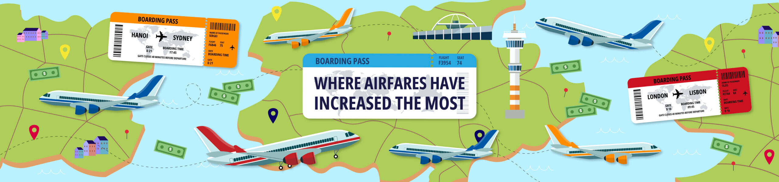
Travel is becoming more expensive worldwide, with flying, in particular, seeing steep price increases in recent years. From fuel costs and inflation to increasing demand, there are plenty of factors influencing air travel companies to raise airfares and charge passengers more.
To reveal which areas have been hit the worst by rising airfares, the travel insurance comparison experts at Compare the Market created two separate indexes. Our first index analyses which Australian routes have seen the largest increase in price and interest, using two factors: airfare increases over time and search volume. The US index looks at average airfares, increases in airfare costs, airport parking and the average hotel cost at a four-star hotel.
Wondering if your local airport makes the list? Read on for our breakdown of where airfares have increased the most.
To inform our rankings, we assigned an indexed score from 0 to 100 to some of the most common air travel routes in Australia. These scores were based on changes in airfare over the last fifteen years and in search volume over the last three years. These are the five routes ranked as having the highest increases in consumer interest and price:
Currently, the total cost to fly between Hobart and Melbourne amounts up to $298.5 AUD with the cheapest available flights costing $243 AUD. This wasn’t always the case, though.
According to our data, airfares across the route have more than doubled in recent years, increasing by 107.9% from 2010 to 2025. Plus, with a 16.9% increase in search volume in the past 3 years, there’s clearly a rising demand for travel between the two cities. These combine to give the Hobart–Melbourne route a score of 86.56 out of 100 in our rankings.
While flight costs between Launceston and Melbourne haven’t risen as sharply as some other routes on our list, with airfares increasing by 57.7% over 15 years, the route has seen the biggest increase in search interest in Australia. Over the last three years, searches for Launceston–Melbourne flights have risen by 22.9%.
This rise in popularity gives the route a score of 81.22 out of 100 overall. On average, flying this route including parking costs for 3 days could set you back $180.50 AUD, with airfares starting at $127 AUD.
Scoring 77.08 on our index, flights between Adelaide and Melbourne have also seen a huge price increase over the past 15 years. With airfares rising by 110.8%, costs along the route have more than doubled to $276 AUD, making it the route with the second-highest total increase nationwide.
While its 10.5% increase in search volume in the past 3 years also reflects a higher demand for travel between the cities, it’s not enough to earn it one of the top two places on our list. Instead, the Adelaide–Melbourne route finishes in third place.
Continuing the trend of rising flight prices to Melbourne, the Canberra-Melbourne route stands out as the Australian flight path that has seen the sharpest increase in airfares since 2010. With the cheapest ticket costing $276 AUD, airfares across the route have increased by 120.5%.
Although costs are soaring across the route, its search interest has remained relatively unchanged, with just a 3.2% increase in queries over the last three years. This brings the route’s total index score to 68.14 for a fourth-place finish.
Finally, the Adelaide-Sydney route rounds out our top five, scoring 53.96 out of 100 according to Compare the Market’s analysis. Airfares across the flight path have risen by 67.9%, with the cheapest air ticket now costing $310 AUD.
Similar to the Canberra-Melbourne route, flights between Adelaide and Sydney have only seen a slight increase in search volume over three years, with online interest rising by just 4.2%. Still, its total score is enough to earn fifth place, beating routes like Melbourne-Sydney (50.87) and Brisbane-Sydney (46.22).
Since the US is much larger than Australia, there are numerous flight routes between major cities, so we’ve decided to rank the airports with the highest increases in travel costs (between 2009 and 2024). We also included the average hotel cost in our index score, along with three days of airport parking. Here’s what we found:
With a total score of 76.99 out of 100, San Francisco International Airport ranks as the US airport with the largest overall price increase in recent years. The airport’s average airfare is $445.13 USD ($625.20 AUD), marking a 33.1% increase over 15 years.
What makes San Francisco stand out in our list, however, is the price of its hotels. With an average night at a four-star establishment costing $770 USD ($1,081.49 AUD), it has the most expensive stays of any US city. Combined with three days of airport parking for $81 USD ($113.77 AUD), a typical trip costs a massive, estimated cost of $1,296.13 USD ($1,820.46 AUD).
Another West Coast airport, Seattle-Tacoma International, takes second place on our list. The Washington-based airport has seen the average airfare increase by 26.2% between 2009 and 2024, with a typical ticket now costing as much as $400.25 USD ($562.16 AUD).
Additional costs include $141 USD ($198.04 AUD) for three days of airport parking and $435 USD ($610.97 AUD) for a night in a four-star hotel. These bring the total cost of a trip to $976.25 USD ($1,371.18 AUD), giving Seattle-Tacoma International a total score of 65.74 out of 100.
As one of the busiest airports in the US, it’s no surprise that JFK International Airport makes an appearance on our list. With a total score of 65.42 out of 100, though, it places less than a point behind Seattle-Tacoma International, showing how closely contested our top five is.
While a four-star hotel is relatively affordable in New York compared to other US cities ($241 USD per night on average, or $338.49 AUD), three days of parking costs $147 USD ($206.47 AUD), which is among the most expensive in the country. The average airfare at JFK is around $431.52 USD ($606.08 AUD), up 32.7% in 15 years.
Salt Lake City International Airport is not only the second-most expensive airport in the US based on average airfare, with a typical ticket costing around $450.03 USD ($632.08 AUD), but it’s also the airport with the largest cost increase since 2009. Over 15 years, ticket prices at Utah’s biggest airport have shot up by 42.5%.
Combined with three-day parking for $75 USD ($105.34 AUD) and $239 USD ($335.68) for a night’s stay at a four-star hotel, Salt Lake City earns a fourth-place finish on our list of US airports where costs have increased the most. It scores 60.57 out of 100.
Finishing off our top five is San Diego International Airport. With a score of 54.38, it narrowly beats Detroit Metropolitan Airport (53.59) and Midway International Airport (53.00).
The average airfare at San Diego International is $375.91 USD ($527.98 AUD), which has risen by 27.9% since 2009. Now, with three days of parking costing $94 USD ($132.03 AUD) and a typical four-star hotel costing $377.00 USD ($529.50 AUD), an average trip to the city costs $876.91 USD ($1,231.65 AUD).
As airfares rise around the world, it’s more important than ever to plan your travel carefully to avoid potential overspending. Adrian Taylor, Executive General Manager of General Insurance, says:
“If you’re looking to keep your air travel costs down, consider travelling at off-peak times, as more in-demand flight times tend to fetch a higher price. You can also try flying with less luggage to avoid extra fees or look into other modes of transportation if you’re travelling a short distance.
“Travel insurance can also help you stay on top of your plans and account for any unexpected issues, such as missed accommodation or lost baggage. At Compare the Market, you can compare travel insurance and search quotes from a range of brands. Just remember to check the Target Market Determination (TMD) and Product Disclosure Statement (PDS) to understand exactly what is and isn’t covered by your policy.”
This dataset ranks the 20 most-travelled domestic flight routes in Australia based on how much fares and popularity have increased, using 2 key factors. Each factor’s data was collected and normalised to a score between 0 and 1. If data was missing, a score of 0 was given. These scores were then combined to give each route a total score out of 100, and routes were ranked from highest to lowest. Additionally, a total cost was separately calculated using all numerical data.
The ranked factors used are as follows:
The non-ranked factors used are as follows:
The factors were indexed as follows:
A second dataset ranked the 31 large-hub airports in the US, based on how expensive it is to travel via each, by using 4 key factors. Each factor’s data was collected and normalised to a score between 0 and 1. If data was missing, a score of 0 was given. These scores were then combined to give each country a total score out of 100, and countries were ranked from highest to lowest. Additionally, a total cost was separately calculated using all numerical data.
The factors used are as follows:
The factors were indexed as follows:
All data is correct as of 03/03/26. The ranking data shown is a compilation of multiple data sources and may not be representative of real life. USD to AUD exchange rate was calculated at a rate of $1 USD to $1.40 AUD on 03/03/26 using Google Currency Converter. All data is accurate with regard to the sources provided.