The Burrow
Jun 29, 2021
Since the pandemic started to slow and the world has begun opening back up again, we’ve seen more and more people returning to travel. As experts in travel insurance, we’re happy to see travellers venturing out once again and safely exploring new corners of the world.
With so many wonderful places to visit that each differ vastly from one another, we understand the importance of being well prepared for your journey and particular destination. But, what’s the best way to prepare for a truly global trip?
Thankfully, there are a number of options when it comes to travel insurance. For example, annual cover could be an option that works well for you – it offers automatic cover for an entire year for a number of trips, but be sure to check the maximum number of travel days that are covered per trip. Whether it be domestic or international (depending on your particular policy), annual travel insurance can be a great option for someone wanting to bounce around on a globe-trotting adventure. Keep in mind however, that annual cover is subject to a pre-determined maximum trip length restriction – typically this is either 15, 30, 45, 60 or 90 days. Any losses that occur on trips outside of the selected maximum trip length will not be covered by your policy.
This type of cover can also be useful for people who regularly travel for business or personal enjoyment, but with a spontaneous twist. If you like to travel regularly but don’t always plan it well in advance, annual cover may be the better option.
If you’re simply looking to be covered for a set amount of pre-determined time, a regular travel insurance policy will do. When purchasing through Compare the Market, you have the option to list all of the countries that you intend to visit and what inclusions you would like added (such as cruise ship or snowboarding cover). Keep in mind that policies can be subject to exclusions, restrictions, and limits, so it’s important to check the Product Disclosure Statement (PDS) before purchasing so that you understand exactly what you’re covered for.
Another important way to prepare for a multi-country trip is to plan the best route, so that you’re not unnecessarily wasting time bouncing between countries that aren’t in close proximity to one another. The easiest place to start is by studying a few maps and becoming acquainted with where each nation sits on the globe. You may be surprised to see a few countries have changed their names over the years, so don’t be caught out by assuming the world is the same way as it was decades ago!
With this in mind, we decided to explore the evolution of world maps, to see how we got to the comprehensive and interactive version of maps that we use today. Be inspired as we take a journey from the past into the present to get a better understanding of how maps have shaped our view of travel, and how they have remained a vital part of the travel process for hundreds of years.
It’s important to remember that these maps are a product of their time. Land and water masses may be distorted, disproportionate, or in the wrong location altogether. Most of the maps in our animation were produced by European and Arab cartographers. Their maps typically focus on their ‘known world’ at the time, leaving out other continents like North and South America, and Australia.
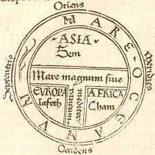
Some maps are fairly simple, such as the ‘T and O’ style seen in Isidore of Seville’s Etymoligiae, which divide the world into Asia, Africa and Europe, with an intersection of water separating all three.
Other maps are highly detailed and painstaking affairs, such as Ptolemy’s World Map detailed in his work Geographia from the second century AD (translated from Greek into Latin in 1407).1 Ptolemy’s World Map was based on mathematic calculations, astronomy, notes from travellers and an early form of latitude and longitude developed by Greek astronomer Hipparchus roughly 200 years prior.2
When looking through history, it may appear that mapmakers regressed when it came to map accuracy. As an example, Ptolemy’s World Map (while not perfect) is more detailed and informative than Isidore’s, despite being written roughly 400 years beforehand.
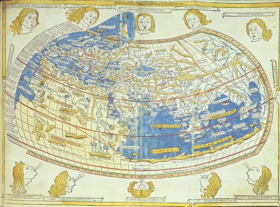
One reason for this ‘regression’ is that after the fall of the Roman Empire, Ptolemy’s Geographia was ‘lost’ and wouldn’t be found again until almost a thousand years later in Byzantium, and then translated from Greek to Latin.3
Another reason is the spread of Christianity and Islam, which influenced all aspects of society, including maps.
Between the fall of Rome (which occurred during the fifth century) and the Age of Sail (generally defined as the mid-16th century to mid-19th century), medieval maps were almost as much a spiritual and cultural text as they were a practical one. This can be seen in the peculiar orientations of these maps and where they were centred.
Many maps produced by cartographers hailing from Christian Europe put Jerusalem at the centre of the world, due to its religious and cultural significance. They also typically placed east at the top. Most theories suggest that this was because the sun rises from the east, and that was understood to be ‘the top of the world’.4
Arabic maps from this period mostly place south at the top. Theories range from:
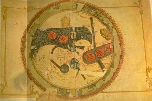
Ancient maps may need to be rotated and flipped around to compare them to the standard ‘north-at-the-top maps of today.
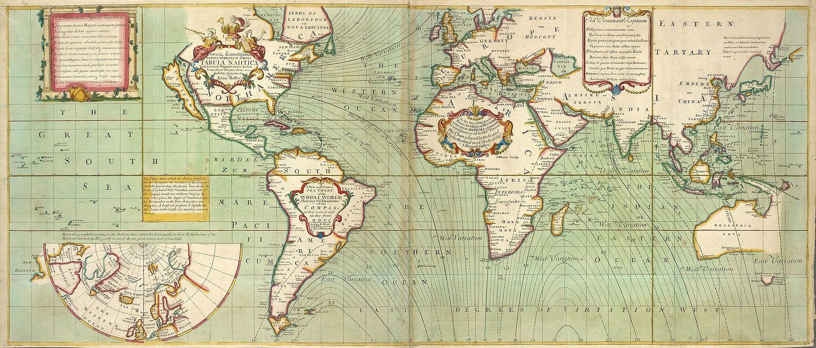
Advancements in shipbuilding technology, science and mathematics following the Renaissance (15th to the 16th century) saw world exploration explode as colonial powers discovered ‘new’ lands. Continents began to be mapped out more accurately, and the pieces of the puzzle began falling into place.
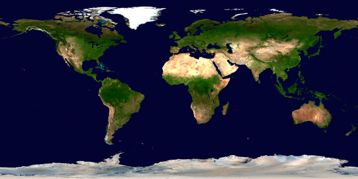
Further technological advancement, such as the invention of the aeroplane, made it possible to map the Earth from the sky. After the deployment of satellites that orbit the planet from space, we now have an accurate and complete map of our world.
Brought to you by Compare the Market: Making it easier for Australians to search for great deals on their Travel Insurance.
Sources:
Animation Image Credit